|
If you need to add product properties or variations such as size, colour, style, shape etc. you need to use options. With ViArt Shop the options can be set up for a whole product type as well as for an individual product. Please see section 18.7 on setting up product type options.
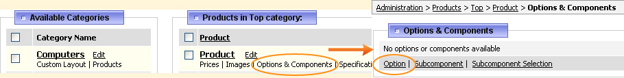
Individual product options can be set by going Products > Products & Categories and clicking on Options & Components link under the product name.
All the options fields are divided into several sections: Main option settings
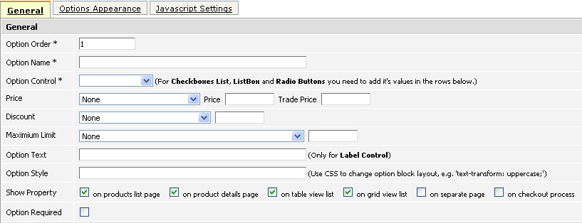
Option Order - This determines the position of the option among other options. For example, if you enter '1' in this field, then this option will be displayed as the first.
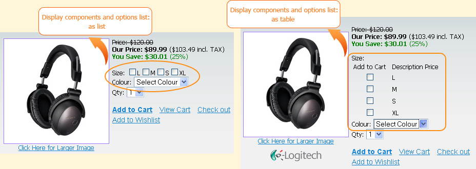
Option Name - This is the title of the option, for example it could be Size, Colour, Type, Shape etc. Before proceeding to option control selection please note, there is a setting in Products > Products Settings > Appearance tab - Display components and options list which has two choices as list or as table and this accordingly effects the outlook of options, for example as in the screenshot below.
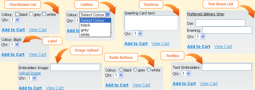
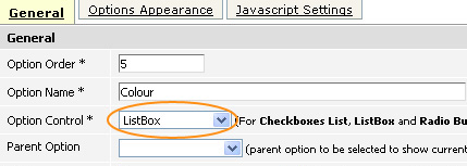
Option Control - There are a few standard option controls available. The display format for these could be seen in the screenshots below.
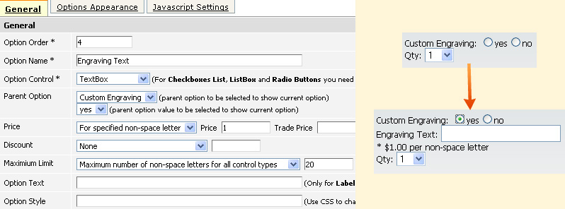
Parent Option - With the help of this setting you can set up dependent options. First you need to select the dependent option from the drop down box and then you may even select specific value for which to display the current option. For example, if you sell shirts and offer custom engraving you may create an option 'Custom Engraving' with two values 'yes' and 'no' and then create another option 'Engraving Text' which will have parent option 'Custom Engraving' with the value 'yes'.
Price - Here you can set up the list price and/or trade price for the option. The price could be set as:
Discount - You can set up a discount for options price. There are a few discount type choices:
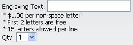
Maximum Limit - when using text option controls you can set up a limit on allowed number of symbols.
Note: when using price, discount or limit settings, there appear a special footnote on the website informing about these settings. In case you would like to change these default messeges (e.g. '$1 per non-space letter' etc.) you can edit them in System > System Static Messages (see section 81.6).
Option Text - This a default value for Label, Textbox and Textarea controls. Option Style - By putting here CSS styles you can change the option's appearance. For example, if you type in 'border: 1px solid red;' there will appear a red border outside the option, if you type in 'text-transform: uppercase;' the option's name and its values will appear in uppercase letters and so on. Please note the tags entered here will be applied to the whole option. If you want to customize only the appearance of option values you should use the 'Control Style' in the 'Options Appearance' section. Show Property - You can select the pages on which this option will be visible. In addition to product listing and product details page there are available such pages:
Option Required - If this option is checked, then customers must choose one of the option values in order to proceed with the purchase of this product.
Option values
This section is required if the option control is Checkboxes List, Listbox, Radio Buttons or Text Boxes List.
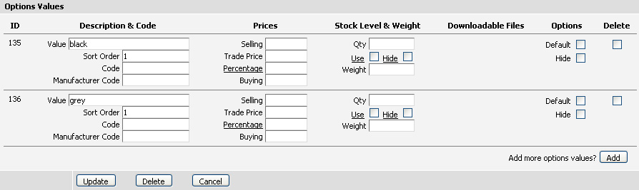
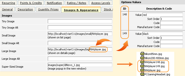
Description & Code fields provide additional information about the product such as the option selection fields, their order and codes.
Note: in case product has a value in Code and/or Manufacturer Code fields in Products > Edit Product then option's Code and/or Manufacturer Code will be added to them. For example, the Code on Edit Product page is '123' and option's Code is '555' then the code displayed on checkout will be '123555'. Whether to show Product Code/Manufacturer Code on checkout and basket can be set in Products > Products Settings > Appearance tab. Whether to show these values in invoice/packing slip is set in Orders > Printable Page Settings.
Prices fields determine extra charges for option values that will be added to the total product cost.
Stock Level & Weight fields help to set stock levels on particular option value.
Downloadable Files - This setting works only for downloadable products which means if there are some files uploaded in Products > Edit Product > Downloadable tab then you can select one of these uploaded files here.
By ticking Default checkbox you can set some value/values to be automatically selected.
By ticking Hide checkbox you can temporarily hide this product's value.
Ticking Delete checkbox will delete the value after you update the page.
To add more option values click on the Add button.
In case you would like to delete the whole option with all its settings click on the Delete button.
Option appearanceThis section tells the system how the option should look. In order to customize its view you need to use HTML tags. 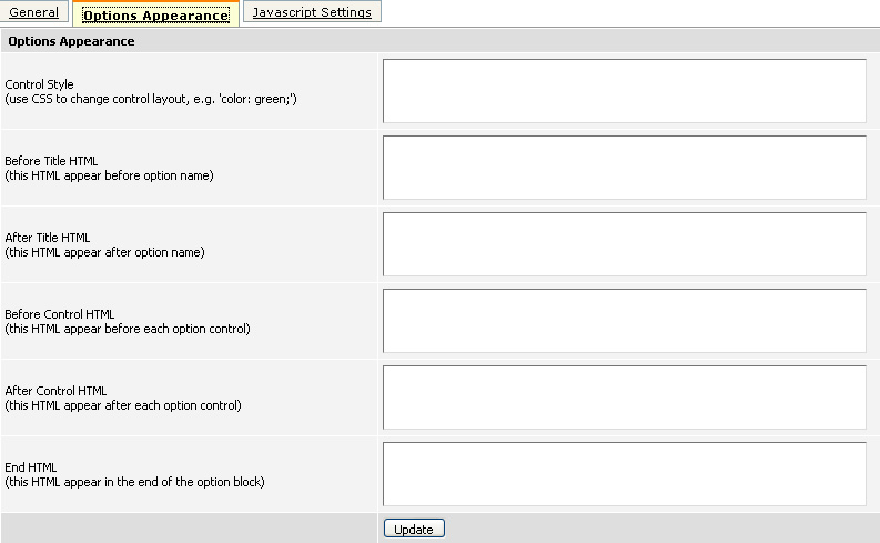
Control Style - it is the same as the 'Option Style', except that its value is applied only to the option values. Before Title HTML and After Title HTML - these boxes contain HTML tags applied to the option name. Before Control HTML and After Control HTML - these boxes contain HTML tags applied to the option values. End HTML - here you can put HTML tags that will be applied at the end of the option block. This can be used for example, if you want to put some text after the option.
Javascript settings
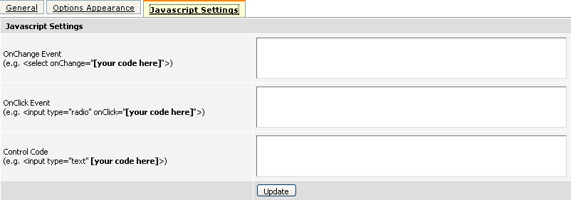
This section allows setting up various Java scripts for different purposes. You can specify actions for OnChange and OnClick events as well as for the control type itself. Here is an example of how you can make the product image change on selecting the option value. For this you'll need to make the following steps:
Note: for this example you can use image of any format (gif, png, jpeg etc.) but don't forget to specify it in the code correctly (value + '.FILE EXTENSION'). 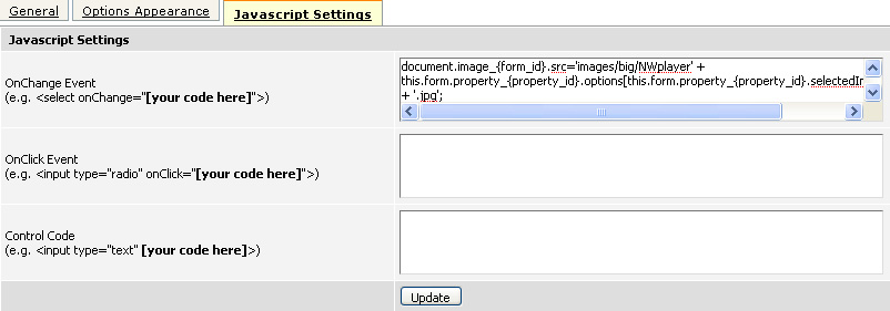
When this is done, click on the option value and product image will change to the corresponding option image.
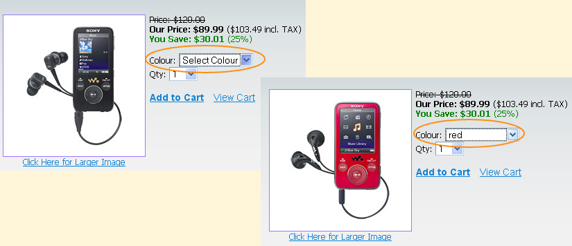
To return the main product image back it is enough to click on 'Select Colour' or refresh the page. |
|
|

